Showing posts with label Process and Production. Show all posts

Sunday, 16 April 2017

Design Tools

In this process and production session we looked at using Cinema 4D and Illustrator to create package labels for product containers. The aim of this session was to teach us how to wrap a flat 2D image accurately around a 3D object in Cinema 4D.

Can

First I went in to Illustrator and used the pen tool to draw half of the outline of my can.


After this I saved the Illustrator file as Illustrator version 8 because no other versions will merge in to Cinema 4D. In Cinema 4D I brought the shape into the view port and then applied a lathe object which wraps the shape and makes it 3D.


Next I created a texture for my can making it shiny with some roughness. I only ticked reflectance in the materials attributes and created a new layer choosing the specular - blinn (legacy) type which creates a very dark grey reflection texture. I created a second layer this time choosing the GGX type which made another reflection layer lighter this time and masked it over the darker texture making a dark silver texture.


Next I went back in to Illustrator and created my 2D can label. I came up with the brand name "Toxic" and the slogan "Seriously Sour Soda". The pattern of the can is made up of the gradient tool using the two colours black and orange covered in bubbles created using the shape tool.


Going back in to Cinema 4D I created a material duplicating the reflectance attributes of the can material and then I went in to the colour attributes and brought in my 2D can label. I then dragged my material to my can lathe object in the object manager. Now my can label was wrapped around my can but the positioning was slightly off. Looking at the list of tools on the left hand side I clicked on texture mode which allows me to edit a map wrapped around an object. I switched to the move tool and dragged my map up slightly so the detail at the bottom was visible as before it was underneath the can.

My can was now complete and now I had to set up my document to render. First I brought in a cloner object and dragged my "can" and "top" object in to the cloner. This duplicated my can sitting them next to each other, I edited the cloner attributes so I had 3 cans including my original and that they were equally spaced apart. Next I brought in a floor and a background object making a basic grey material dragging it both to my floor and background. I then brought in a compositing tag for the floor which combines the floor and background together so they appear as one object. Next I brought in 2 lights and a area light, both lights I positioned at either side of the cans both above the 3 objects so they can cast shadows. The area light I moved behind the cans and then slightly to the left rotating the light so it shines diagonally across the scene. This makes the scene even brighter making it look more dynamic. The final task was to rotate each can so the camera could see a different part of the can as if I had one can no one would be able to see the label displayed behind the object.


Bottle

Again I started in Illustrator drawing part of a bottle and imported in to Cinema 4D.


I brought in a lathe object and applied it to by spline which transforms it in to a 3D object.


Next I went in to Cinema 4D's content browser and found a glass material preset which was a dark green because that is what is found with majority of beer bottles. I then created a new material turning on reflectance and transparency and within these subheadings I changed the colour to a dark yellow almost like a murky gold. I applied this material to the liquid inside the bottle as this will represent the beer itself.


After this I went back in to Illustrator and started to design a label for my beer bottle. I decided I wanted to make up a brand that could have been designed 200 to 300 years ago and still was around to this day. So I called the beer Morning Star and then had two of the weapons overlapping each other.


After finishing my label I went back in to Cinema 4D and brought a cylinder in to the scene. I moved the cylinder into the middle of the bottle and then changed it's size until the cylinder was just sticking out of the bottle. Next I created a new material and imported my label as the material, when this was done I dragged the material on to the cylinder. Now there was the illusion my label was wrapped around the bottle.

Finally I set up my scene using the light objects, floor and background but this time I also decided to take models from the content browser and set up a scene the bottle would be found in.


What Did I learn?

I learnt the basics of wrapping a 2D image around a 3D object which acts as the objects texture. Additionally I now know how to create my own texture using a range of other software to apply to my 3D models. This session was a huge insight for me because it is the basics towards being a texture artist and if I aim to be a 3D modeller the skills of a texture artist will also benefit my work. 


Thursday, 30 March 2017

Self Publishing: Wall Mural

In this process and production session we experimented with type designs in groups of 7 before agreeing on a favourite and then using it to create a giant wall mural. The activity would help us work with other people as a team and give us ideas on how we would approach a big project for the future.

Each group chose a word from a hat at random and our group got the word "Prend le!" Our first task after this was to generate different typefaces. After each person had an idea we collected them up and voted for a favourite.


This typeface was the winner which was drawn on gridded paper because the plan was to have each grid as an A2 page and then this drawing could be used as a guide. 

Our next task was to copy the type face on to a much larger art board. We had 30 pages of A2 paper which would act as a frame and then we put each frame together like a jigsaw puzzle. When we finished drawing the typeface, again we pulled another word from a hat but this time it would be a colour we had to use to paint our type. The colour we pulled out was yellow and we decided that our type would look good if we painted the inside and outside of our 3D letters, instead of painting the letter itself. When we finished doing this we found we had a problem which was seeing the pencil from our drawing because the yellow was so bright. Our solution to this was to also paint the outline of our word with a thin brush which looked even better than out previous idea.


Now our final task was to put our type up on a wall and use a camera to create a stop motion reveal of our word. As a team we agreed that a transition where every 3 tiles from the left is revealed and continues towards the right would look the best. We began by sticking all our pages to the wall but in a random order and then starting from the left we would put 3 tiles in the correct order and then take a photo. We repeated this process until getting all the way to the right side where by then the whole word was revealed.


What Did I learn?

I mainly learnt how I would approach painting such a big art board without getting any of the positioning of my drawings mixed up and the solution to this was to draw the image in frames and then use each frame as a page. This made the whole process so much easier and gave a sense of organisation because it works as breaking the image down by focusing on one frame at a time only looking at what goes in that space. While you are drawing in each frame you forget about the overall image and then you start to worry about what it will look like at the end but it all falls together and surprisingly works very well.   

Thursday, 16 March 2017

Demo Reel Test

In this process and production session we gathered together our best process and production work and created a demo reel to give us a idea of what should go in a demo reel and how it should be made, tips on how to grab companies attention when looking for placement.

As a student I won't have much or any industry work so my demo reel can be aimed at 30 seconds but no longer than a minute because my reel should be short and snappy to grab and maintain my audience's attention without boring them.

I used Illustrator to make my title frames for the start of the reel and the individual projects so there is a little introduction for my work. I made every object it's own layer so I could animate transitions for example making the text slowly appear when its time for them to be revealed.

I was reading a blog written by game developer's Naughty Dog who wrote a post about how to land a job with a AAA games company and there was a video of a demo reel which was submitted to Naughty Dog that got a 3D modeller a job with them. At the end of the reel the artist had his contact details and web address on screen with images of logos from the software he is experienced in which gave me the idea to do the same thing.


My demo reel is just over 1 minute at the moment so I have decided I am going to use less projects to shorten the video. I don't want to use some of the projects in this reel as my main interest is 3D modelling so I plan to include more projects like the mine cart and the t-shirt.

What Have I Learnt? 

This session has given me valuable experience towards making my desired demo reel with dos and don'ts. Keep it simple because over complicating my demo reel could reveal bad work or something companies won't like. Keep it short because I don't want to waste people's time. Aim your demo reel around a specific ability and area so people have an idea of what you want to do.

This demo reel I can use as a template and something to improve on when I come to create my final demo reel for looking for placement.

Thursday, 9 March 2017

Self Publishing: Abstract Typography

In this process and production session we made and used stencils to create patterns with paint. We were given three different alphabets each a different font and we analysed them one at a time, drawing part of the characters as shapes on A3 paper. When I filled the A3 page with shapes I cut them out using a craft knife giving me a stencil to use, next I painted over my stencil on A2 paper moving my stencil either rotating it or simply moving it to experiment with mixing shapes and patterns.

Pattern 1

This stencil and pattern uses the shapes from the Baskerville Bold font and I took shapes from many letters from the alphabet including the number "7" and the letter "I".


Pattern 2

My second pattern uses the font Courier Bold and again I used the number "7" because I wanted at least one character I use in all three patterns so I could compare their shape.  


Pattern 3


What Did I Learn?

This session helped me realise that if I want to make something or generate ideas I can get the information from literally anything if I analyse fine detail. Before this session if I saw the fonts I would automatically think "oh different alphabets" but now examining really fine detail and shapes I can see how different they really are and the smallest detail can make great ideas. 

Monday, 20 February 2017

Patterns in Cinema 4D

In this process and production session we explored and experimented with different techniques to create different 3D patterns in Cinema 4D.

Tunnel Pattern

The first technique involves creating a really long tunnel in 3D and then applying materials to the tunnel to create patterned illusions. To begin I brought in a rectangle and then a extrude object and in the object manager I put the rectangle in the extrude object so the rectangle became a cuboid. Next I adjusted the size of the cuboid making it really long and I made sure there was a lot of space inside. I then brought in a twist modifier and applied it to my really long tunnel so the pattern inside the tunnel will spiral. The next task was to create a material to apply to my tunnel, in the material manager I turned off colour and transparency and left luminance on. I continued to add the checker board texture to the luminance tab which resulted with black and white stripes for a material. After applying  the material to my tunnel I brought in a camera and positioned it inside the tunnel so the pattern was visible in the view port. Next I brought in a sphere and duplicated my striped material but changed the colour to white and green and applied it to the sphere. I moved the sphere so it was at the end of the tunnel to add and finish the pattern.


At this point the pattern looks really interesting and cool but it is still just flat colours that isn't displaying any 3D depth. I went into the render settings and switched on ambient occlusion which adds shadows and depths to the edges of the model which gives it more realism in a 3D space.


I created a animation using the pattern with the idea of bouncing a collection of balls through the tunnel. I brought in a emitter object which fires objects in the direction it is facing and in the object manager I move the sphere in to the emitter object so the emitter fires multiple spheres. Next I moved the emitter behind the camera so it shoots the balls in the direction where the camera is looking but the problem then was the balls were falling through the tunnel so I had to let Cinema 4D know that the tunnel is a object and a collision should happen. I went to the sphere in the emitter object in the object manager and applied a rigid body tag which tells cinema 4D that this object should react when it hits another object, and then I went to my tunnel in the object manager and applied a collider tag to it which tells Cinema 4D that it should react when another object collides with it. The result now is when the balls are fired out of the emitter they bounce off the walls of the tunnel and roll down to the bottom of the tunnel.


Generated Pattern

The second technique I learnt how to do was creating a quick 3D pattern that generates never ending possibilities of different patterns and colours by slightly changing attributes in the material and object manager. I started with a plane object bringing it in to my viewport followed by a displacer modifier which appeared in my object manager next to my plane object. I dragged the displacer modifier in to the plane object and in it's shading tab I add a noise effect so the displacer modifier takes effect on the plane object turning it from a flat object into a crumpled object almost like a creased rug. The plane at this point didn't look real enough because the edges were too sharp and pointed so I brought in a sub division surface object and dragged the plane in to it so these edges were smoothed out and were more rounded. The next step was to add colour to my plane so I created a material and again turned off colour, reflectance and turned on luminance. In the luminance tab I added a gradient texture and inside the gradient tab I changed the type to "2D - V" which means that when the material is applied or wrapped around the object it goes horizontal instead of vertical, while "2D - U" is the term for wrapping a material vertical around an object. I then created four colours within the gradient tab: Cyan, purple, green and pink with cyan taking up half of the material followed by purple taking up a quarter and then green and pink sharing the last quarter. Now in the gradient tab of the material I can change a number of attributes (e.g. frequency, scale and octaves) to make different patterns really quickly.


Patterns Using Particles

The last technique I learnt was how to create a pattern using the emitter object. I started by creating eight materials all using just the luminance effect consisting of two shades of grey, a yellow, a orange, a light blue, a dark blue, white and finally black. Next I brought nine planes in to the scene making seven of them squares and two of them thin long cuboids. Then I applied the two cuboids the black material and then the other six planes each a different colour from the remaining materials. Next I brought in a emitter object placing all my planes inside it in the object manager and then placed the emitter on floor in my viewpoint facing up. In the emitter's settings I turned on "show objects" and "render instances" so I can see the emitter firing the planes in to the air in the render. Next I changed the speed, variation and angle so the emitter spits out the planes at a nice pace while they fly out at an angle so they all split up. After finishing setting up the emitter I brought in a background object and applied my luminance white material to it so in the render behind my pattern it is white. Finally I brought in a MoText object making it say "Post Modernism" as that is the style of pattern I have made and positioned it right above the emitter so the planes fly past it towards the camera.


What Did I learn?

Before this process and production session I had a slight idea how I would approach creating patterns in Cinema 4D but I didn't realise there were some many options and additionally an unlimited different patterns to make. The techniques I learnt have improved my approach to making patterns and textures in Cinema 4D and have prepared me to experiment with my own patterns if I need to. A feature in Cinema 4D I didn't know about before this session was the ambient occlusion option which is really helpful especially when you need to emphasise the depths of making an object 3D.

Thursday, 16 February 2017

Info Graphics

In this process and production session we experimented with Info Graphics which is when data and graphs are presented in a creative way. We were given the task to collect data about ourselves and present it in a map and a bar chart.

The Map

In Illustrator I created a simple map of my journey to University from my accommodation in Huddersfield. I started by importing a map of Huddersfield in to the first layer so I could work over the top of it and use it as a reference. Where the university is close to the town centre I used the line tool to draw a graduation hat and at this point I decided to use the Marker Felt font through out the project. Next I analysed the map for the most iconic land marks in between the university and my house and created drawings to represent them. Now I had enough of the map shaped out to draw the line that represents my journey from the house to university. I continued drawing more lines that showed the rivers going through the town centre near university. Finally I made the background colour behind the reference map green because it is the common colour I find on standard maps.


When I finished my map in Illustrator I imported it in to After Effects and put it in to its own composition. Next I animated the red line that represents my journey to university with the stroke effect. I started by using the pen tool to trace a path on the red line which allows the stroke effect to follow this path and then I made a keyframe at the start of the path within the stroke attribute and then another keyframe at the end of the path. Finally I changed the stroke colour to cyan so now in the animation a blue line follows the red line from my house to university. Now I created a zoom that at the same time follows the blue line and to do this I created a new composition and placed my new animated map as one layer. I clicked the 3D effect on the one layer in my new composition which puts the map in to a 3D space allowing me to tilt the whole thing on the X, Y and Z axis. Now all at once using keyframes I changed the position, the scale, X axis rotation and the Y axis rotation to create the illusion that a camera is zooming into the map and following the animated line.

The Bar Chart

My bar chart was created on Illustrator and it showed how much time I spent on social network websites in a day. The bar chart was very simple, I created rectangles to use as the bars and the websites I use are Facebook, Twitter, Gmail and Youtube. I wanted to make the bar chart more inviting to look at instead of black and white so I coloured the bars in the colour used in the website's logos or what is seen on their webpage.


I imported my bar chart in to After Effects to animate and to join it with my map animation. I wanted to make the bars in my bar chart appear one at a time from left to right and to do this I used the time line to create keyframes when the bars were at their shortest, then I created more keyframes when they were at the size that represents the amount of time I used them further down the timeline. After creating the animations for each bar I moved them in order on the timeline with Facebook first and then ending with Gmail so when the animation plays Facebook extends first followed by the other bars going to the right.

The Transition

The animation would be slightly more confusing with just the map followed by the bar chart so I created a quick one second transition introducing the bar chart. I created the transition on Illustrator coming up with the simple design of the word "Time Spent" as the same font as the bar chart and map  inside a rhombus. I wanted to follow a similar colour scheme but for it to stand out more so I swapped the colour around having a black background and green text.


I imported my transition design in to After Effects to animate with a number of choices of transitioning techniques to choose from. I only had one second of animation for the transition so I didn't want a transition that travels across the screen because I feared that it would happen to quickly for the viewer to read the text. I found that using the opacity feature in After Effects was the most feasible making my transition screen slowly appear and then disappear. On the timeline where I wanted the transition to start I created a key frame and set the opacity of my "time spent" layer to 0% and then I went to the part of the timeline where I wanted the transition to end and also set the layer's opacity to 0%. Now in the middle of these two keyframes I created another keyframe and set the layer's opacity to 100% so now the layer will slowly appear until the opacity its 100% and then slowly disappear completely.

The Final Outcome


What Did I learn?

During this session I learnt why info graph animations are made and how people go about making these animations. A cool feature I learnt how to do in After Effects was using the stroke feature combined with the pen tool that makes a paint stroke follow a path that was created by the pen tool, we used this to represent our journey on the map.

Thursday, 2 February 2017

Self Publishing: The Stencil

In this process and production session we learnt how to make our own stencils and then use them to create propaganda posters. The propaganda theme was the French revolution in 1968 and each of us had the task of pulling out a word from a bag which gives a specific theme from 1968 to focus on.

I pulled out the word "Police man" so I looked up the police from the French riots and I decided to use the basic look of the uniform they used to wear as an icon.


The next step was to draw an image on A3 paper which then can be cut out using a craft knife. After sketching ideas I came up with a simple drawing of the police man's helmet with the goggles on and then next to that another drawing of the rifles they used to carry. When I finished cutting out both my drawings I had my stencil which I placed on another sheet of A3 paper and painted over it with a paint roller so both my images were displayed in red paint.


Now I pulled out song lyrics from another bag which I made another stencil with to add to my poster. My lyrics were "Drown me in your sweet submission" and these words act as a slogan for my propaganda poster. When I cut out my words with a craft knife I was happy that I managed to finish but it took me a long time and I struggled to make it neat. Before I started cutting with a craft knife I wasn't very confident because before this session I can never recall ever using a craft knife so it was something that was new to me. Next I painted over this stencil in blue adding it to my poster.


I have recently seen stencil work similar to this which made me really intrigued to try it so I am grateful to have done this session. The stencil work I saw was from a video game named "Infamous Second Sun" where the protagonist of the game spreads his propaganda around the city of the Seattle either trying to expose the corrupt government in power or using it to make the citizens fear him depending on what the player wants to do. The character of the game is portrayed as a punk who likes to put up street art so his methods to producing propaganda is using stencils out of cardboard that he supposedly finds around the city and spray paint.


I really enjoyed this process and production session because I liked painting over a stencil I made and the results look really good. Using a craft knife to cut with is interesting as well but I became frustrated at times because I needed sometime to get use to how it worked. In the future I could enjoy doing this more regularly which will give me the practice with a craft knife.


Sunday, 29 January 2017

3D Logo

This process and production session used Cinema 4D but from a designer's point of view. We looked at how a designer would approach the software to produce their work and ideas in 3D. Using Illustrator we were tasked with creating a simple logo using the pen tool and then import that file into Cinema 4D to make it a 3D object.

A important note before starting the project is to create a folder and naming it the name of the project and then create another 3 folders inside naming them "Illustrator", "Cinema 4D" and "Output". This prevents confusion with file types as the Illustrator logo will be saved in the Illustrator folder and the Cinema 4D logo saved in the Cinema 4D folder then the output folder will be used for saving the final movie or image file of the project.

Starting with opening Illustrator I used the pen tool to experiment drawing shapes until I was happy with one I wanted to use as a logo. The logo could be separate objects which will be seen as one group in Cinema 4D but the drawings couldn't over lap each other. I had one shape for my logo but I did make the mistake of drawing another shape inside my original shape thinking that it will be apart of the logo in Cinema 4D and I soon realised that it wasn't there when it becomes a 3D shape because it fills the original shape hiding the additional shape inside.


Now I have my logo so I start up Cinema 4D and go to "file" and then "merge" which imports my Illustrator file of the logo into Cinema 4D. Next I set up the render settings so it saves my project as a image and not a movie by setting the rendering output to current frame and not all frames to save the first frame that my logo will be on. My next task is to make my flat 2D logo in to 3D, to do this I select the extrudes nurb bringing it in to my object manager where I drag my 2D logo (in the object manager) in to the extrude nurb. This applies the extrude feature to the logo now making it a 3D object.

Next I needed to set up the environment for the project. I started by adding a background and floor to my scene then creating a material that I applied to both objects so they are the same colour. At this moment in time even though the floor and the background have the same material they are both different colours and that is because the floor is not apart of the background and cinema 4D is showing this by purposely making the floor a different colour so I don't get confused with which is which. To change this I needed to add a compositing tag to the floor object and then in the attributes manager of the tag I ticked the "comp background" box to allow the floor to be apart of the background.

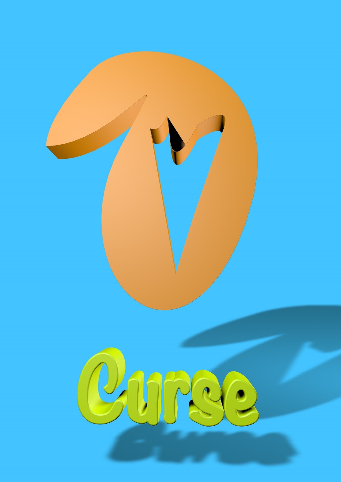
Next I could add colour to my project. I went in to the material that I already had for the background and floor and changed the colour to a light blue. I created another material and changed the colour to an orange and applied it to my logo. The next part was to add text to our logo giving the brand a name. On the tool bar at the top it says "MoGraph" then I went down to "MoText" to add the MoText object to my object manager. In the attributes manager I typed "Curse" because I decided that is what my pretend my brand was going to be named and the text in y scene became "Curse". Next I created a new material making it a lime colour and applied it to my text, then choosing a font for my text.

Now I needed to set up the environment for my scene so my logo casts a shadow with correct amounts of lighting. I start by bringing in a standard camera to my scene and position it in the centre facing my logo. Next I bring in two standard lights in to my scene and I name one "key" and the other "fill". The key light is placed to the right of the camera at the same height and then the fill light goes to the left of the camera but the height of this one is between the camera and the floor.


After rendering the logo as a finished image we continued to animate it for animators and motion graphics. The plan was to have the logo rotating at its position. In the object manager I selected all the objects that makes up the logo including the text and grouped them so Cinema 4D recognises them as one object to animate. On the timeline at 0 frames I select the grouped object of my logo and set the rotation on the y-axis to 0 degrees and then I go to the end of the timeline (the last frame) and change the rotation on the y-axis again to 360 degrees. This now rotates my the logo.


What Have I learnt?

During this session I learnt how to import Photoshop and Illustrator files in to Cinema 4D and I also learnt the benefits of using Illustrator to prepare a project for Cinema 4D. If I want to render out 1 frame as an image I now have more of an insight on how to to do that and not make the mistake of rendering hundreds of frames as high detailed images. Another technique I learnt and was starting to wonder how I would do this is creating a all in one background it is one colour without the floor and background interfering with each other.

Thursday, 26 January 2017

After Effects 2.5 Dimension

In this process and production session we learnt about the 3D aspect in Adobe After Effects. In Adobe After Effects 3D is known as 2.5D because as the software focuses on 2D it can't produce the full dimensions of 3D. Our task had us creating art in illustrator with a theme of Huddersfield and then we used 2.5D in After Effects to zoom out of the art board to create the illusion the camera was passing the buildings in a 3D environment.

The first step was choosing a scene in Huddersfield to draw into Illustrator.  I chose a common building seen in Huddersfield but with a very old style which includes very big windows to be the first building at the back of my scene. Next I decided to include the Sainbury's next to the main road  with the store's building, a Sainbury's sign, a street light and a red bus stop, followed by the road. My plan is for the camera to zoom out showing each of these objects to be in a distanced order.


The next step is to import my illustrator file into After Effects and set up the composition. When I have my imported files in to a composition I needed to activate the 3D feature in After Effects. The feature changes the composition depth which allows you to have layers behind each other with controllable distances between them. The button to activate the feature is found in the layer manager next to each layer and it looks like a 3D cube.


Now I needed an additional view which looks down at my project so I can see and organise my layers  on the Z-axis. At the bottom of the composition window there is a drop down box that can split the window into multiple views of the project. I clicked on 2 views and changed the 2nd view to top so I could see my project from above.


This is the top view of my project. The white lines are the different layers I imported from Illustrator. The layers are 2D flat pages so from above they would appear as thin white lines like looking at paper stood up from above. The next step was to organise the layers in to position starting with the old building at the back, followed with the Sainbury's store, then the Sainbury's sign, then a bit more distance in front of that the street light and bus stop next to each other and finally the road.


Next I needed a camera that will do the animation by zooming out of the Z-axis to create the illusion that the layers have distance between them, one by one revealing them into the scene. The camera is a layer of its own so I created a new layer and selected camera. The camera appears as a red triangle in the top view, the point at the bottom is the camera itself and the lines protruding out is what the camera sees. 

Finally I needed to change the position of the camera and put keyframes for these movements on the animation timeline. At the beginning of the timeline I moved the red triangle right to the top past the white line at the top of my "top" view and added a key frame. I moved to the end of the timeline and then moved the red triangle down so it was completely visible and added another keyframe. Now when I played the animation the camera would start zoomed in past all of the layers and slowly zoom out passing each layer while keeping each one in view.


What Did I Learn?

This session in After Effects taught me that the program had a 3D feature that I didn't know about. Working with the 3D feature gave me more understanding with what I should use it for as it isn't true 3D because you can't see the layers from the left or right only backwards and forwards in a 3D space. Additional to this I also learnt how to apply textures to layers and backgrounds allowing me to personalise my projects.

Tuesday, 20 December 2016

Stop Motion

In this process and production session we focused on stop motion using a webcam, a clamp stand and software called Dragon Frame which specialises in stop motion animation.

In a small group we used a small doll of a vampire to animate with and the first thing we did was experiment with the doll walking to get a feel and a idea of the distance the doll should move for every frame.


After we felt we got the timing right for our movement we moved on to experimenting with the doll falling and how this would look like in stop motion.


Next we wanted to try something different so we had the idea to experiment with facial expressions in stop motion. We used a number of drawings and stuck them to a stuffed basketball to create a character who appeared to go through the changing of feeling.


Finally we decided that we wanted to join the two together (the doll and the basketball) and have them interact with each other so we made the doll roll the basketball off the table.


What Did I learn?

The main aspect I learnt during this session was the software itself that we used for stop motion. I never knew about dragon frame before but now I am familiar with it and I think it is a pretty good program for this type of animation. Along the way we discussed stop motion as a profession and the technique professionals use using a green screen to get rid of props and equipment that they don't want in their movie.

Monday, 19 December 2016

Lip Synch in After Effects

This process and production session saw us using After Effects to create a system that easily applies different mouth and eyes shapes to a character to create a quick, accurate lip synch animation.

Preparation

The preparation for this session was already done for us and we used the work for After Effects but in the future the first thing to do is to create a character in Illustrator with their eyes and mouth on separate layers.


Setting up to animate

I started by opening After Effects and importing the Illustrator file of the character. I then opened the composition with all the layers for the mouth and made each mouth shape layer a second long before making them sequence layers (they don't overlap each other). I repeated this process with the eyes composition and then put both the eyes and mouth composition under one main composition.

After this I selected the mouth and eyes compositions and enabled time remapping which leads me to create a null layer and then I applied two slider controls for that layer, one for the eyes and one for the mouth. When this was done I matched each number on the slider with a layer from the compositions so for example the 2nd layer in the mouth composition was the shape of the mouth making a "E/I" shape so I applied that layer to the number 2 in the slider. I also did this for the other slider with the eyes composition. Even though the numbers on the sliders were now linked to the layers in each composition when you move the slider it didn't change the mouth or eyes shape on the character in the main view port, so to activate the sliders I had to click on the pick whip symbol next to the time remap effect on both compositions and drag my cursor to each of the sliders. Doing this creates an expression for the time remaps that allows the sliders to change the shapes in the main view port.


Animating


The After Effect's document is now set up to animate specifically lip synching. All I did now was analyse a audio file with speech and I put in markers on where I think the shape of the mouth changes. Then in After Effects I use these markers and my notes to select a mouth shape using the slider to quickly choose the right one for each frame.


What Did I learn?

During this session I learnt and realised that I can set up a basic system using After Effects to animate more quickly in the future. I learnt how to use time remapping and I learnt what it is used for, using a combination of the slider and time remapping I can quickly select and use layers to animate. 

Monday, 12 December 2016

After Effects Puppet Animation

In this session we concentrated on character animation in Adobe After Effects and experimented with different tools and techniques to set up a quick easy method to animate characters. We looked at making a 2D character walk from imported layers made in Illustrator. 

2D Walk Animation

The first thing I needed to do was to import the Illustrator file and make sure that each layer in the file were separate to each other, the reason for this was so I could move the layers individually within After Effects. It looked like this.


The next step is really important and crucial to making the body parts moving realistically. There is a tool called the pan behind tool and what this does is moves a symbol on each body part that is known as the central pivot which is what the object rotates around. Of course the central pivot is in the middle of all the objects so I had to move them in to the right place and the right place is where we would find a joint on a real body, e.g. the arms joint is at the top where the shoulder meets so this is where the central pivot will go.


After this I dragged each body part together to form the complete character  and then in the layer manager I made the body the parent layer for the other layers so now when I move the body the other layers will follow.


Using the walk sequence reference I rotated the left and right arm in to the correct position on the specific frames so when my character walks his arms will be swinging forwards then backwards. Next I needed to get the character to start bouncing up and down to create some realism to the movement so again on the right frames I slightly move the character up and then down.


Finally I needed to move the legs but it isn't as easy as rotating them into position because of the angle the foot and knee are in during the movement. So to enable more control over the legs I used the puppet tool which allows me to attach points to specific parts of the leg which I can then drag to move the knee or foot without moving the while leg. So now, on the right frames using my reference I rotated the leg but then also moved the knee and foot to create more fluidity in the movement.


What Did I Learn?

In the past I had a slight understanding on how to make a character in Illustrator and then animating in it After Effects but I didn't know the specifics to do it properly. I knew I needed to create each body part of my character in separate layers to import to After Effects but I didn't know about the pan behind tool to change the central pivot to make a character move properly. I also didn't understand how to use the puppet tool properly and that it is used to move more specific parts of a body part. Now however I am well aware of these tools and how to create and animate a character using Illustrator and After Effects.